Explained: Why India’s Inequality Is Underestimated
Survey limitations and omissions of the ultra‑rich and the most vulnerable are leading to a skewed picture of inequality

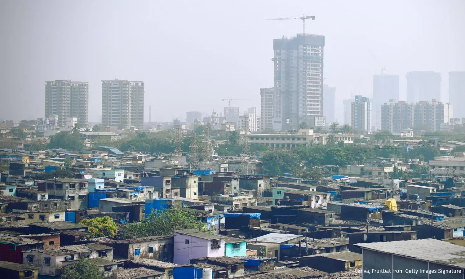
Noida: India’s consumption gap appears to shrink, but income inequality is rising fast, as per analysis of India’s consumption data by the World Bank.
India’s consumption‑based Gini coefficient--a common measure of inequality--fell from 28.8 in 2011-12 to 25.5 in 2022-23, suggesting a narrowing in consumption inequality, according to World Bank data. But experts caution this figure likely understates the true scale, due to survey limitations and omissions of the ultra‑rich and the most vulnerable.
The Gini coefficient is used to quantify inequality in a single number. It runs from 0 (perfect equality) to 1, or 0 to 100 if expressed as a percentage, where higher values indicate wider disparities. The Gini coefficient is derived from the Lorenz curve, which plots income distribution: the further the curve deviates from a line of perfect equality, the higher the Gini.
Since comprehensive income data are lacking in India, especially due to a large informal economy, analysts use consumption as a proxy. But that tends to smooth out extremes at both ends of the spectrum. For instance, higher-income individuals tend to save more, and may be excluded from these surveys, meaning consumption data often underestimate actual inequality.
The paradox here is that while consumption inequality seems to have eased, income-based inequality tells a different story. Using tax-return data, the World Inequality Database and the World Bank find that India’s income Gini rose from 51 in 2004 to 61 in 2023. This indicates a growing concentration of income at the top.
However, while consumption data themselves are sound, the difference in methodologies over the decade makes comparisons fraught with errors, experts told IndiaSpend. In this explainer, we look at income, consumption and wealth statistics in India.
Income data unavailable, tax returns used as proxy
All socioeconomic surveys conducted by the government in India leave out questions related to income. That is because in countries that are dominantly informal, income is very hard to calculate, said Jayati Ghosh, an economist and former professor at the Jawaharlal Nehru University in New Delhi. “Take a farmer, for example. To get their income, you’ll have to value all of their input and their labour and everything and work out what price they sold their output at for every household you’re surveying,” Ghosh said.
Economists have found a workaround for this: income tax returns filed by adult working members of the population. The World Bank uses the World Inequality Database (WID), compiled by a team of experts which includes Thomas Piketty, an economist who specialises in inequality.
The World Inequality Lab does not calculate the Gini coefficient because for that, you have to estimate the entire distribution, explained Ghosh. “What they do instead is use the share of incomes of the top 10% and the bottom 50%. That is actually easier because most of the top 10% at least pay income tax. In India, they don’t; only about 7% submit returns, and less than 5% pay income tax, but using those, you can get some idea of income.” That is an additional measure of income inequality, Ghosh said.
This ratio--the share of incomes of the top 10% and that of the bottom 50% of the income distribution--is 19.2, according to the WID, the database used by the World Bank. This means that the richest 10% of the population earns nearly 20 times as much as the poorest half of the population. The top 10% of the richest people in India earn 57.7% of the national income, as per the WID database. This makes India among the most unequal countries in the world.
Even this is an underestimate, according to Ghosh. “We do have some estimations of financial wealth, or the value of declared property. We don’t know about the money stashed away, and the paintings they are buying.”
The one survey that does include questions on income, the India Human Development Survey conducted by the National Council of Applied Economic Research, shows that income inequality is much higher than consumption inequality, she added.
Consumption data leave out the richest and poorest households
The National Sample Survey Office groups the households it surveys by consumption expenditure. The surveyed households are asked to report the amount of money they spend on food, rent, utilities, and on services like education and healthcare.
Before the 2011-12 round, surveys used a uniform recall period of seven days on all reported items. A recall period is the time period over which respondents are required to report data, and different recall periods yield different results and errors, depending on the frequency of expenditure on an item, according to a World Bank study from Ghana.
When using a uniform recall period, surveyors record all expenditures incurred in the last 30 days. On the other hand, in a mixed recall period (MRP), they capture data over a month for eatables and over 365 days for durables such as clothing, footwear, education, and healthcare. In the modified MRP, three different recall periods are used: seven days for items like pan, tobacco and other intoxicants; 365 days for consumer durables, clothing, and footwear; and 30 days for all other items.
The 2011-12 round had data from all the reference periods, which by itself does not make the data incomparable to more recent rounds, according to P.C. Mohanan, former acting chairman of the National Statistical Commission. The crucial difference is the number of visits made by the survey team, he added.
“The surveyors ask you what was the expenditure during the last seven days on food because you remember that over seven days very well. For certain items you ask about the last 30 days, such as medicines etc. Then for long-term things like hospitalisation or school, you ask with a reference of one year period,” he explained.
Earlier, all these questions were asked in one sitting, Mohanan pointed out. “Now, on their first visit they ask about food expenditure. Then after a month, they come and ask about other frequent expenditures, like clothing. On their third visit, they ask about durables expenditure.”
This gives the respondents enough time to recall since the surveyors concentrate only on one section of the questionnaire at a time, leading to more detailed and to-the-point answers.
“This will actually give you a much higher expenditure level because you are making more detailed efforts by visiting the household three times. So they have a lot of time to answer and you can collect data for a larger set of items,” he explained.
The NSSO publishes data on consumption every five years, except for a few deviations. The previous round, data from which were withheld because of “variation in the levels and consumption pattern as well as change in direction of the change”, which] “would have led to inaccuracies in the estimates”, according to the government, was held in 2017-18. The one before that was held in 2011-12, also using a mixed recall period.
However, since these data are from households, they leave out the homeless and people like migrant workers who live 15-20 in dwellings that do not fit the definition of a household, according to Ghosh. “We also do not ask the very rich how much dal did you consume in the last month.” This makes the consumption inequality an underestimate too.
Wage disparity and employment
Poverty estimates are also derived from consumption data. Therefore, the poverty lines that were used to estimate poverty headcount ratios were also derived from the consumption data.
“The poverty lines that most experts have been using so far are based on the earlier one-visit kind of schedule (for the survey). So that poverty line will be slightly lower (than if it were calculated using more detailed data),” explained Mohanan.
Multi-dimensional poverty estimates are different from those derived from the consumption data. These poverty estimates measure poverty of access to a minimum acceptable standard of living, as we reported in 2022.
In a statement released by the Press Information Bureau, the government claimed that its initiatives played a role in reducing poverty and inequality. “Targeted schemes like Jan Dhan, DBT [direct benefit transfer], and Ayushman Bharat have helped close long-standing gaps. At the same time, programmes such as Stand-Up India and PM Vishwakarma Yojana are helping people create wealth and secure livelihoods on their own terms.”
There were five different estimates of poverty in India at a time, as IndiaSpend reported in 2023. In addition, the people who live above the poverty threshold are deprived of several basic services, as we reported in 2022.
IndiaSpend has written to the Ministry of Statistics and Programme Implementation for comment on the revision of the poverty line based on the latest consumption data, the differences in the methodology between successive rounds of survey, the number of jobs created by the PM Vishwakarma Yojana, and the number of active Jan Dhan accounts. This story will be updated when we receive a response.We welcome feedback. Please write to respond@indiaspend.org. We reserve the right to edit responses for language and grammar.


